Shady Shadows

Visual Assignment #1

In all honesty when I take a picture (regardless of what it is) I always try to not incorporate shadows because for me, it can sometimes ruin a picture. Because of that particular reason I thought that the Shadow of Doubt assignment would be an interesting task for me, where I could try and visualize shadows as a form of art. Based on the shadow that was created it can be assmed that the object in the image is a plant, but what kind? It’s a bamboo plant! I chose this object because it was the only object in my bedroom that stood out to me. I also chose it because of how clear the shadow was.

20170525_215843

The creation of this photo involved an ordinary yellow lightbulb and a bamboo, but of course you all already knew that! II placed the lightsource on the opposite side of the room, so that the shadow would be less intense. However, the only problem to look out for when doing that is to make sure no other shadows interfere. For example, it took me a couple of tries to only get the shadow of the plant onto the wall because my shadow kept interferring. Once I made sure I had just the shadow of the plant and I was satisfied with my picture angle, I captured the image. And Viola!

20170525_215630

Head up Princess, or the Crown Slips

Just a friendly reminder.

Back to Basics

The goal of this assignment was to remove the color from a photo to make it appear as if it were a stencil in order to see how the focus shifted.

I chose a picture of my old horse at a show we had done years ago.

If the picture had been in color, many people’s focus would have been drawn to the ribbon hanging on the bridle. However, now that the color has been removed, I find myself focusing on the darkest part of the picture; where my hand meets my horse’s nose. Looking at the picture, you cannot actually see where my hand meets his nose, but I know it is there. I think this is representative of the bond between horse and rider. That bond is something that not everyone can see, but the rider knows is there.

Remnants of the Past

I was riding through a field when I thought about a year prior when we were warming up at a three-day event. This picture illustrates what it was I saw while at the event. The memories are so fresh in my mind that they start to come into focus.

Jumper Problems

Found this picture that was taken of me at an event over the summer. My horse and I were outside the jump ring awaiting our turn. I had looked at the jump course earlier that day and had walked it when the ring was open for walking the course. I am not sure whether or not I remembered this specific course, but I have definitely forgotten where to start a course moments before entering the ring and end up having my trainer remind me quickly.

Back to your roots, Bob

I really like pixel art, but I’m no pro. I decided to do 256 Points anyway. I used to spend a lot of time editing Pokemon sprites and making Frankenstein’s monster-esque trainers and Pokemon, but I thought I’d stick with today’s theme and go Animal Crossing. So here’s my boy Bob the cat.

Bob 2400x Zoom

  Here he is, but smaller! Embedded via WordPress, since flickr doesn’t seem to be a fan of tiny images.

Like my previous project, this was done in paint.net. I pretty much just used the color sampler and the pencil tool for it, given that it’s 16×16. I started by opening up a teeny-tiny canvas and toggling the grid (which makes it so much easier to look at). I grabbed a reference picture of Bob from the Animal Crossing Wikia so I could pull colors and make it look at least a little bit like him.

Steps1

Then I got to drawing. I used the circle tool to make his head and the rest was freehand with the pencil. I pulled another sprite from the AC wikia for reference material, but it was 32×32 and I also just didn’t like it very much. You can see it up in the corner being lonely.

Steps2

As for Bob’s pose – his personality in the game is “lazy,” so a lot of his dialogue is about being sleepy, eating, and living a generally laid-back and slow-paced lifestyle. I thought it was appropriate to have him relaxing with his hands (or paws) behind his head and his eyes closed. Having closed eyes also saved a bit of room on his face for his goofy mouth.

I did end up shifting him one pixel to the right and giving him a left elbow after all was said and done – the single blank column on the righthand side seemed wasteful.

We Amélie the guy

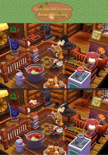
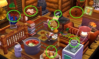
Someone’s been into Erik’s house and messed with all his stuff. They left a letter saying six things were changed, but in reality, they changed seven things just to drive him crazy. I wonder what he did that made him deserve such a thing.

Spot the Differences

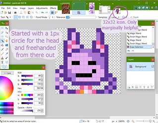
This is another one I’m particularly happy about because the only part I didn’t make myself is the pattern on the top! The room design and title card were all me. Allow me to continue patting myself on the back. Pat pat.

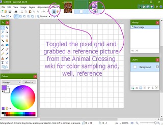
The font on the title card is Fink Heavy from freakfonts.com, and boy am I glad I found it, because I know I’m going to be using it all the time now. The project itself was done in paint.net – I haven’t seen it recommended anywhere so I suppose it’s not the best software (it is woefully lacking in some areas), but it’s the one I can navigate the best since I’ve been using it for a few years.

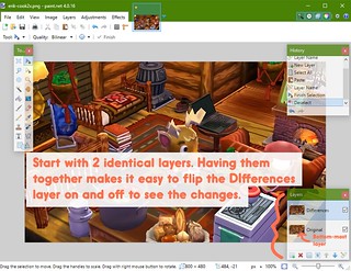
I depended a lot on layers for this one – I kept the original as a base layer so I could keep flipping back and forth to see what changes had been made and where. If I noticed I was making too many changes in one area, I tried to branch out. I had a lot of stuff going on in the lower right quadrant at first, so toggling my “Differences” tab helped me to see where I could do more work.

difference-walkthru1

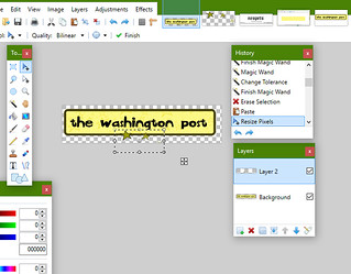
Changing the laptop screen was a nightmare and a half. I actually had to duplicate the image and make this change separately. Because the laptop itself is black, it was hard to use the fuzzy/magic wand to select the screen without it selecting the entire laptop and everything around it that was dark. Once I was able to clear the laptop screen (like below) I created a second layer, moved it beneath the original layer, and pasted a screenshot of the DS106 blogs page into that bottom-most layer. After a lot of resizing and rotating, it finally looked… pretty alright.

transparent laptop screen

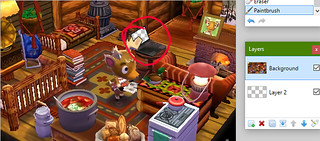
I first made the screen transparent so that anything I put beneath its layer would be framed by the laptop’s borders.

laptop pasted

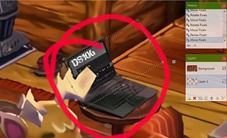
Then it was a simple copy/paste into layer 2, then resizing and rotating until it looked passable.

Remember I mentioned I ended up doing the whole laptop business in a copy of the original picture? After I finished sticking a screen on there, what I ended up doing afterward was selecting the newly edited laptop, copying it, and then pasting that sucker over top of the non-cooperative laptop in the original image. Voila. Then it was on to the easy stuff like pretending that baguette never existed!

I knew going in that editing the photo (especially removing things) would be really difficult. I was tempted to just redecorate the room in the game itself (eg. replacing the lantern, putting a poster on the wall, changing the color of the books or turning the pot of stew) but I’m still happy with how it turned out.

Here are the answers, but I think a lot of changes I made were fairly easy to find.

Spot the Differences Answers

Would you buy this paper? Or join this hoity toity community?

For my second visual assignment, I chose to do “What a Crappy Font Will Do” not just because the title made me chuckle, but because I do get some sick kicks out of seeing serious companies use comic sans or papyrus. It’s always spas that use papyrus. What’s up with that? Here’s the first of two font-swaps I did:

wapo

The font is Heffaklump from dafont.com. The background for the title I scooped right off of Neopets – admittedly, right off of my own login page, because I still log in once a month to put my pets in the Neolodge. Then I selected a color from one of the stars in the background, darkened it, and used it to create a rounded rectangle border. Neopets doesn’t seem to use this design anymore, but I remember it from old layouts and I liked the way it separated the title from empty space.

The actual Neopets logo has little black stars around it, but I’m not really an artist, so I grabbed a transparent PNG of an older logo off google and isolated the stars. In a new layer I pasted the (transparent!) stars in and placed them around the new logo.

wapo3

For the tagline/hanging sign (which I thought was quintessentially Neopian) again I sampled colors directly from Neopets. In this case, it was the clock in the upper right hand corner of the screen. I kept the base color the same, but darkened the outline color to better match the main title sign.

wapo4

Now that WaPo is full of whimsy, who will take its place in the world of hard-hitting journalism? No worries. It’s like the prince and the pauper, friends.

neopets

The title font is Old London, again from dafont.com. This was a far easier piece to put together, aside from having to figure out what the heck fonts WaPo used for their tagline (Georgia) and date (still couldn’t figure it out). There isn’t much in the way of color and doodles, but I think Neopets now has a quiet dignity.

Perfect Blue… and the imperfect path to that gif

Check it out!!


View post on imgur.com

For my first visual assignment, I decided to Say it Like the Peanut Butter with Satoshi Kon’s 1997 thriller, Perfect Blue. It also just happens to be one of my favorite movies. This is the pivotal scene in which Mima (a pop idol who quit the music biz to jump into acting) is consumed by her paranoia. It is also the first scene in which the viewer is shown a glimpse of who Mima’s “lookalike” stalker truly is – her own manager, Rumi, who had grown disgusted by Mima’s foray into the more adult world of television acting. Mima’s paranoia is justified, but she remains in grave danger.

This project initially started off being MUCH more ambitious. This gif is only 12 seconds… the one I wanted to make was 45! Kon’s ability to convey a sense of unease in a place as small and cute as a young lady’s apartment is unmatched. My computer certainly could not match it, and I had to continuously trim down the video. Welp.

I began with this video of the scene in its entirety and downloaded it at http://www.save-video.com/. It’s easiest just to put the word “magic” between the “you” and “tube” in the original video’s URL, because you’ll be redirected to the site automatically. Once I had the video downloaded, I used this guide from the DS106 Wiki on how to create animated gifs using MPEG Streamclip and GIMP (both of which I had to download).

The directions on the wiki are fairly straightforward, but darnit if I didn’t nearly lose my mind trying to trim things in Streamclip. That definitely took more trial and error than anyone should ever need.

The roughest part was having to start over a few times after realizing that the gif I was trying to make was just too long and that it would crash Streamclip after 50 or so frames. Very unsatisfying.

mima06


Once I finally got the clip trimmed down to a reasonable length, I ended up with 98 JPEG frames. Imagine that. And if you can’t, here’s my Mima frame folder.

mima07

Next up was actually making the gif! Still using the wiki guide, I brought up GIMP and imported all 98 Mimas. They were very cooperative.

mima08

mima09

I never actually knew how gifs worked until now. I suppose it’s pretty obvious and I should be facepalming myself into another dimension… but wow. It’s a flipbook, but INSIDE THE COMPUTER.

mima10

Forgive my audacity for categorizing this assignment as my best work. I’m just really proud of it! (/o\ )”


Guess the Thing Part 2

For my next assignment, I had to take a distorted picture of something and make it as unrecognizable as I could. Can you guess what this is?

IMG_0689