Wally World over time

The first web assignment I completed was the 2-star Way Back Time Machine and it was really interesting. For this assignment we used the WayBack Machine to search for a particular website and see how it’s changed over the years. In doing so, we must provide commentary on whether the changes have been beneficial or not.

While I admit I’m not a personal fan of Wal-Mart, I decided it would be interesting to see how its web design changed over the years. So first lets take a trip through time.

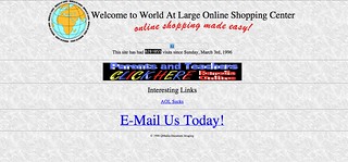
Wal-Mart’s website went live in 1996 and it looked like this on December 29th, 1996:

12:29:96

Fast Forward to November 7, 2000 and it received a bit of a makeover:

11:7:00

Two years later, December 3, 2002,  its more colorful:

12:3:02

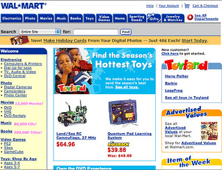
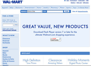
On December 29, 2004 the website has more tabs and its slogan is added under its name:

12:29:04

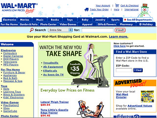
Just one year later, in 2005, the color scheme is all blue and white, much more dull and it takes away a full row of tabs on the top.

12:29:05

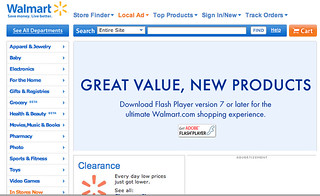
In 2008, the site has pops of orange and yellow. There are more tabs on the sidebar as well.

12:29:08

December 29, 2010, the site is just a little more tailored and has been this way ever since.

12:29:10

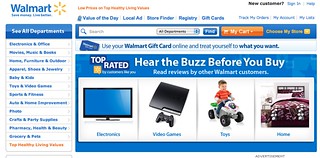
The way the Wal-Mart website looks now is the best it has been over the years. Clearly it has made a big transition since its first design in 1996.  In 2005, it had a period of very dull colors and looked very drab. But I think the pops of orange and yellow, against the blue really make the site stand out.

It’s design now is very user friendly and easy to navigate. The front page highlights specials and deals the store has and then a person can look under different categories for the specific product they are looking for. Anytime I’ve had to search for a product, its been easy to search and find. I think that Wal-Mart has created a website that appeals to its consumers and is user friendly and organized for everyone.


Hackasaurus

To complete Storytelling within the web, I chose to intervene in the design of a post from Craigslist.  Before even searching on Craigslist, I chose to take the easier Hackasaurus approach instead of altering raw code.  I downloaded the X-Ray Goggles into my bookmark bar, which allowed me to change the text, format, and images of any web page.

I went searching on Craigslist for any headline that caught my eye that I could make a story about.  I stumbled across a listing of a fairy pin for sale.  I immediately knew what I could turn this posting in to. The original listing is for a winged fairy pin for $5, made of  crystal insets and silver metal.  I activated my X-Ray Goggles and started altering the page.

X-Ray Goggles

First, I made the pin listed by “Fairies R Us” and changed the price from $5 to “Priceless”.  I then spruced up the description by saying it was made of Diamonds, Platinum, and Swarovski crystals. Finally, I created the illusion that wearing this pin would allow you to fly and would protect you from air planes.  I added a twist by doing a spin-off of an alcohol commercial when they say, “Please fly responsibly.”  Also, you have to go to the sky to buy the pin according to the location.

My edited site can be found here.

I wanted to make this page in my own site, but I couldn’t get it to work.  The NotePad program wouldn’t let me save my code.  There were no error messages, but whenever I hit “save”, nothing happened, so I just published the site and obtained a URL (found above).

Where in the World?**

Google Map Trip, worth 2 stars, called for me to tell a story of a trip I’d taken using Google Maps.  I chose this web assignment to increase the challenge on web storytelling and because I had just taken a trip today!

Google Maps

My team at UMW traveled to Poolesville, MD today to play American University.  We left the University (A) at 8am and stopped at WaWa (B) to get breakfast (tradition).  Once we got food and drinks, we got on 95 N and drove for 1.5 hours until we reached Poolesville (C).  Unfortunately, once we got there, we discovered there were no toilets at the field (WHAT), so we quickly piled back into the vans and found the closest place with a bathroom…A church (D)…AWKWARD!! We then went back to the pitch (E) and played our games. On a side note, both our A & B sides won!  On our way back home, we zipped to a McDonald’s (F) before sitting in traffic on 95 before we got back to Uni (G).


Lost in Translation*

To dabble in some web storytelling, I completed the web assignment Google Translate Fail, worth 1 star, from the ds106 assignment bank. I chose this assignment because as a French minor, I know how google translate can interpret another language into English.  First, I went to the website for the Le Monde newspaper, a famous paper in France, and then found the sports section.  I thought sports would be an interesting topic to translate. There was a cool article on The X Games (ou Les X Games) that I took the summary of and translated it in Google Translate.

“the Winter X Games Europe Tignes is open” actually translates to “the European Winter X Games opened Wed. in Tignes.” Then “Story in pictures” is more closely translated to “the images depict/show”. Finally, the last part is better meant as “which leaves those extreme skiing junkies very hungry.”

Fullscreen capture 3202013 33224 PM.bmp

Way back when

For my final assignment this week, I decided to do one called the Way Back Time Machine.

Using the Way Back Time Machine website on Internet Archive, take screen shots of a favorite website overtime. Then, look at how the website has changed for better and worse.

I’ve done this before, just for fun, on sites like Facebook and Reddit, so I thought it would be interesting to see the progression of a different website. I chose to work with YouTube mostly because no one else had done so yet, and also because the site has changed so much recently I figured that there must have been changes over time that I didn’t notice.

I stuck with one month throughout the years–October. I don’t really know why I chose October, but I just went with it.

YouTube began in 2005, so my first screenshot is from that October 1st of that year.

After looking at all these different snapshots of YouTube, I have to say that they still haven’t gotten it right.

The first two years, 2005 and 2006 were the worst, of course. So many tabs and links, I don’t even know what I’m looking at. Then, 2007, 2008, 2009 all have this really strange “Videos being watched right now.” I never understood that. I don’t think I ever saw one video that was in English when I would go onto YouTube during those years. At least the developers reduced the number of tabs at the top of the page. They also introduced “community” into the mix. I wonder if this was in an attempt to draw in the MySpace/Facebook crowd?

I say this because in 2010, this tab disappears. Also, thankfully, the “Being watched right now” section disappears. Trending videos were added as well as a section for “recommended videos.” Big brother begins. In 2011, the developers changed pace and made the homepage about different categories for videos. Completely ineffective. Who really looks up videos under “Music”? I have a feeling that most people know what they are searching.

In 2012, the developers must have been upset with somebody. I remember looking at this homepage and going, “Where is everything?” The site began to look a lot like social networking sites that updated you on what your subscribers and people you have subscribed to are doing. I don’t want to know who liked what video.

Finally, we end here in 2013. Probably the MOST effective website layout so far, but definitely not the most efficient. I wasn’t sure what was on this homepage for a long time. Are these just random videos? Are they the most favorited? Most liked? Most viewed? In addition, the sign in button is up in the upper right-hand corner. For someone like me who goes through multiple gmail accounts in a day, this has become the most frustrating aspect of this layout. I can never easily get to it unless Google Chrome takes up my entire screen.

Overall this was an interesting exercise in frustrating website layouts…


October 1, 2005

October 7, 2006

October 1, 2007

October 2, 2008

October 2,2009

October 2, 2010

October 2, 2011

October 2, 2012

March 23, 2013


Henry VIII’s got SWAG – ???

As a History major, I just had to do this web assignment from the assignment bank called “What They Might Have Done In Social Media.” Now, I was disappointed that the example was Lincoln, mostly because I know a lot about him now that I’m taking Civil War in American Memory. But oh well!

I went out of my history comfort zone for this one: I went all the way back into European history for Henry VIII. I figured he would have a VERY interesting Twitter/Facebook if he had access to it back then. He, of all people, would have cared very little about his status as a political leader and would have posted whatever he wanted–or that’s how my limited knowledge of him portrays him.

First, I created a Tweet from him.

Then I moved onto Facebook.

This one took a lot longer to finish. I did a project once on Anne Boleyn, but I don’t really remember an enormous amount about Henry VIII. So I used his Wikipedia article to find some events, especially about his marriages.


You can check out the full Facebook page here.

Teaching Tool

This is a teaching tool I’ve used before in classrooms, and I love it. It requires thought and evaluation of all the information that is out there on a particular historical figure–but it’s also a lot of fun. Most students have at least heard of Facebook and Twitter so having them utilize a tool that they know so well for something educational? Sounds like a good idea to me!

Horrible Burger King Website Translation (*)

For the Google Translate Fail assignment, I stumbled upon a Japanese Burger King website and translated the only parts of the site that werent images (since Google Chrome cant translate those.) This is a screenshot of the bottom of the home page.

Horrible Burger King Translation

For most of these statements, I honestly had no clue what they were trying to say were trying to say. I laughed hysterically hard at “With meat sauce, delicious addition, the popular American cheese fly!” Some pages are just not meant to be translated! Hahaha!

I’m Lovin’ It

I’m Lovin’ It – Justin Timberlake

My last web assignment that I chose was Hidden Stories in a Page {**}. In this assignment, you had to take a web page and insert a hidden story, or commentary from the author.

I started off by thinking of what website I could insert a hidden story. I wanted to do a funny one so I thought for a while. And then, it hit me like a ton of bricks: The McDonald’s Nutrition Page. Oh boy, I had too much fun with this.

Hidden Story in a Page screen shot

There is one main hidden story and a bunch of tid-bits here and there. See if you can find them all when you visit my new McDonald’s Nutrition Page.

I created this with the help of the Hackasaurus tool – which is wonderful and I definitely recommend using it!! It was very simple once I planned out what direction I was going to go in. I wanted to make it seem like the website was talking. Almost as if the website was trying to warn people that all of this information was b.s. and not to fall into the trap!

Web designing is sneaky stuff. I hope Micky Dees never finds this blog post.

Youtube It Your Way!(****)

Ever thought about what it would be like if birds were the superior race on Earth?

For the “Youtube It Your Way” assignment, where we had to pick out a youtube video and change some aspects to give it a totally new meaning, I chose a video of a human and a parrot yelling at each other…for no reason. I then used Hackasaurus to change the title, comments, commenters’ images, the video views, the amount of likes/dislikes, and a few linked video titles in the sidebar. The main topic here is Political Birds, so I made the arguing parrot, originally named Oscar, a governor debating with a journalist on recent issues in the bird world. All of the commenters seem to support Oscar’s rise to the top.

Here’s a screenshot from the original video

Picture 2

And here’s the Oscar Debates With Media version

Picture 2

At the end, the bird thanks his contender for the debate with a kiss! What a good Governor!!

It’s Tricky

It’s Tricky – Run DMC

There was one web design assignment that all of us DS106ers had to do. It was called Storytelling within the Web. For this assignment, we had to recreate an already existing web page.

First, I had to download Mozilla Firefox because I didn’t have it and the Hackasaurus didn’t want to work without it. Unlike my previous downloads in this class, this download was very easy and fast. {That was a nice change!! I feel like I always have a problem with the downloads in this class}. This goggle tool made it super easy to complete this assignment! I had way too much fun doing it, so much so that I thought “there’s no way this is an actual assignment…like for a grade?!”

Here is a picture of the original page:

Picture2

Here is the TRUTH to the DS106 website:

Picture1

You can see it on it’s own site too.

For this assignment, I went for “the truth”. What people would want to see when signing up to take this class. Like I said before, I had a lot of fun doing this assignment. I can see myself using this tool again later to trick people. Hmm April Fool’s Day is coming up…. {muahahahaha <– evil laugh}