
Two colors have been altered


Two colors have been altered
During middle school Kid Cudi was one of my favorite artists and I always blasted this song.

For my last Visual Assignment of the week, I decided to put a Pop Star Out of Place. It is a 3.5 star assignment that asks creators to take an image of a pop star and put them into an unsuspecting (or just an unrelated) background.
I decided to take Prince and found an image of Heathrow Airport (I had just googled images of airports, and Heathrow had an image of an open lobby). I used a similar technique as I did with my movie poster assignment. I used Photoshop to erased the background in Prince’s image and placed it on the image of Heathrow. I don’t think I matched the scales properly when blending, but I tried to get it close without undermining the image of Prince.

#ds106
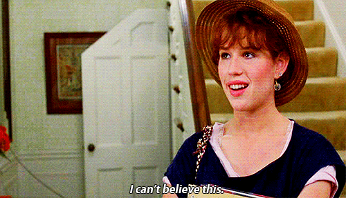
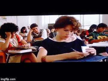
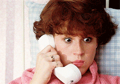
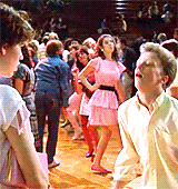
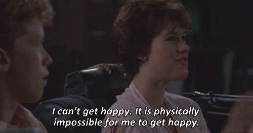
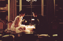
For my third Visual Assignment Bank project I chose a 4 star assignment entitled Summarize a Movie with Animated GIFs.
I chose to summarize Sixteen Candles. I took some GIFs that were already made and then made a few of my own. While I have used GIFs many times before, I have never made one. I used a GIF creator online, selected a clip from the movie, trimmed it to under 20 seconds, and everything was done for me. It was relatively easy and fun to make.
As far as the story telling aspect, it is hard work to summarize a 1.5 hour long movie in 10 <20 second clips. You really have to think hard about the aspects of the film that drive the overall plot. If there were no limits I would probably have included 2 or 3 more scenes, but overall this gifs sum up the main plot line of the film.
*Spoiler Alert*
#ds106
I took this picture in a Habachi Bathroom. I have no idea why I like it so much. Honestly I think it’s just cool.

I did not start watching Game of Thrones when it first came out. I finished the whole series in three weeks, which is a little sickening, and enjoyed every second of it. I used a viking symbol do to my Nordic background. The phrase “ice in my veins” was huge in middle school and I used to tell people I’m a viking and that I actually have ice in my veins so “Veins of Ice” just fit.

my redemption post! the other editing project- linked here if you really wanna see it- I did I ended up being Super Unhappy with. So, I decided to go a little bit more structured for my redemption, go easy on myself to build up confidence. And although the perfectionist in me is still a little bit unhappy with it but overall I am pleased with how it worked out. Alors voila!

Another post brought to you by 80s pop culture! I was gonna go with a “the floor is lava” type vibe, but defining the 80s by what it didn’t do actually proved to be a pretty difficult task; one that I, unfortunately, was unable to accomplish. All’s well that end’s well though! And honestly, I think this speech bubble does better encapsulate the vibe of the assignment, which was to form a more speech-like vibe onto a photo you’ve taken previously with niche/funky body language.
This assignment was a pretty simple one; find a photo where your body is giving off very specific vibes and then speech bubble yourself to match the vibes. I chose this photo because its one of the few in which I’m not just straight grinning, because the everything about me just loves to be smiling. From there, I googled “text bubble” and found this image:
I put the image onto GIMP and then cropped and erased the background until it was just the blue bubble solo. The I added my original photo and got confused about why my speech bubble was showing up. Onto google. “how to layer images in gimp”. Then I figured it out, resolved the issue (I had them in the wrong order), and added my text! Once all the elements were in place, I hid the text and photo and did some final cleaning up of the text bubble (which was only moderately successful and the main reason I’m mildly unhappy with the result).
Overall I think this is a cute assignment, not too hard, and I really good reintroduction to GIMP for me. I’m still by no means a master, but I harnessed the power of the internet and figured out some especially technically challenging things- like how to change the font of the text! In all seriousness I did figure some new things out and ended up with a lovely layered image showing some lovely 80’s pop culture!
dont stop till you get enough, -liz
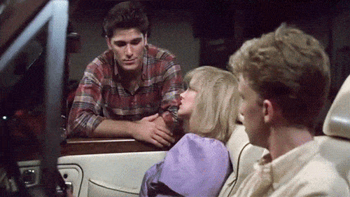
For my second Visual Assignment Bank project I chose a 3.5 star assignment entitled, Create a silly Movie Poster.
I am not sure how “silly” my poster is, but I learned quite a bit by creating it! I learned how to add images/objects to a photo using Photoshop. Photoshop seems a lot less intimidating after completing this assignment.
Utilizing the free Photoshop tutorial I created my poster with the original When Harry Met Sally poster. I then looked at movie posters from other famous 80’s movie posters. Using the layers, quick select, brush, and masking tools featured in Photoshop I erased the backgrounds of the other posters to focus on main characters.
Harry and Sally are now joined by the cast of The Breakfast Club (’85), the Ghostbusters‘ ghost (’84), Jack Torrance from The Shining (’80), John McClane from Die Hard (’88), and Sam from Sixteen Candles (’84).
It’s not perfect, but I gained a lot from it! Hope you enjoy my revamped poster!

#ds106
yall. i made my own assignment.
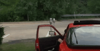
My assignment? A three star, visual assignment that utilizes only a smartphone and ZERO editing software because I don’t like editing photos. So y’all have probably seen this around, but with the iphone (and probs other smartphone) cameras, you can take panoramas, right? and if you play your cards right, you can insert yourself into the photo MULTIPLE TIMES. So thats my submitted assignment. Take a panorama photo and with yourself (or a friend) in it at least twice, but the more the merrier!
I decided to give my assignment 3 stars because it took me a HOT minute to figure it out and even once I knew how to do it technically, getting the shot right was Difficult.
So, like I said, it took me a HOT minute to figure out how to actually do this, so the first 7 or so photos I took look a little something like this:

or this:

or, my personal favorite, this:

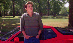
But, after a creative rest and some research (check out this website for some Good Instructions), I finally got the hang of it and came out with some Really Good photos. The one that shows the most technical skill is probably this boy,

But this, one, even though its not as impressive technically has an element of storytelling to it!

And one more, because its Good Quality and I can insert a meaning into it!

This photo symbolizes the dichotomy of humankind, a dichotomy found even within individual persons (as showcased!) (I’m mostly joking).
So how did I do it? WELL. First, you get inspired by some insta post about this very subject and try figure it out without research and end up with a bunch of photos like the first three. Then you cave and do actual research. So the real process is to start you panorama at point A, then have the photographer pan until the subject is out of frame. Then, the subject run around the photographer (so as not to be in the frame) and stands Very Still right before the photographer pans to point B. Alternatively the subject of the photo can just kind of. Run to the next point without avoiding the photographer and sometimes it still works out fine! For this assignment, it’s really a practice makes perfect scenario, so don’t get discouraged and try out different techniques and strategies!
This was SO COOL and such a Brilliant Assignment (which I am saying from a completely unbiased and objective place). In all sincerity, however, I did have a really good time with this assignment; messing around with stories and techniques to make the panos look good and losing my absolute mind over the ones that didn’t turn out as good was just SUCH a good time. I definitely struggled before I knew how to do it, but that just shows the power of research! . Overall i’m stupid proud of all of my panos, even and low key especially, the ones that aren’t technically perfect. in conclusion. yall pls do my assignment im so proud of myself and it really is a fun one!
be good to yourself, -liz