Vintage WMWC Radio

I am the technician for the radio station on campus, WMWC Radio, and I love it. We are the oldest club on campus, although no one knows we exist. For this assignment, I decided to look at how the WMWC website has changed over time.

I used Wayback Machine to go back and see previous versions of the WMWC homepage, which was awesome because I was able to find versions of the website all the way back to 1996.

Click on the photos below to see what WMWC’s website looked like (the date of the photos are in the url):

October 19, 1996
January 28, 1998
October 22, 1999
November 21, 2008
March 24, 2010
October 6, 2011
October 13, 2012
August 19, 2013
September 27, 2013
March 1, 2015
September 9, 2016

I definitely think WMWC’s website is much better than it used to be (not because I designed the current version myself or anything…). Ā I think the 2008 and 2011 versions are some of the nicer versions. They’re cleaner and more functional than previous versions. Overall, the website design has slowly gotten better each year, and I hope to help improve it even more as best I can.

Wayback When UMW’s Website Was Young…

I was first drawn to this assignmentĀ simply by reading the title. Ā I had heard of the Wayback machine, but had never used it myself. Ā This seemed like the perfect opportunity to do so!

The first thing to do was select a website to examine. Ā Originally I considered Wikipedia, but then the idea of examining the school website struck me. Ā This seemed like a great way to make the assignment especially engaging to other UMW students by using a website that is relevant to them.

In terms of assignment completion, please note that I opted to use the snipping tool to grab my screenshots, as I haven’t yet totally figured out how to use my screenshot option (I’ve used it in the past but forgotten how to use it, as the process isn’t very intuitive on this laptop).

My earliest screenshot was from 2004, and I immediately note the immense amount of white space…

may-20-2004
May 20, 2004

In continuing my search, I kept finding that the website links were covering the background with the school title. Ā At first I assumed this must be a mistake in the loading of the Wayback Machine. Ā But this mistake was consistent until late 2010… Ā Also note Professor Giancarlo!

oct-2-2008
Oct 2, 2008

Over time, the link coverage was corrected, and much more color was added, in addition to more dynamic features, such as shifting images (This made it a bit harder to grab screenshots. Ā At one point I accidentally grabbed one mid-fade!).

may-27-2013
May 27, 2013
aug-31-2016
Aug 31, 2016

Ultimately I think I prefer the modern design to the previous options (though that may simply be because the current site is most familiar to me). Ā I think its also interesting to note the changing color patterns over time. Ā Now, excess white space is generally discouraged on most website (a problem of the 2004 version of the site, which was later corrected). Ā Some color pairings are now considered a bit off (the 2008 grey and orangeish-yellow seems an odd combination to me, and apparently the UMW web designers agreed and thus adjusted in latter versions). Ā And now more dynamic sites are popular (as seen in the image-shifting 2013 and 2016 versions). Ā In addition, one can see the new dashboard of the 2016 version, which includes icons as opposed to simple links (again emphasizing the importance of visual richness). Ā Ultimately I think these changes are consistent with the advice we currently receive regarding keeping websites engaging and user-friendly.

Backyard Plans

For my second assignment, I chose to create my ideal room. Well really it will be my idea back yard because I love to spend time outside and that really is my ideal room. The internet gives us the power to research and look for ideas that we like from other places. In essence that is what pinterest is really all about, sharing creative ideas for the average person! This is great because humans no longer have to visit somewhere else to get an idea. They can do it right in their own living room. Anyways, the assignment is worth four points and the link to the prompt is:

http://assignments.ds106.us/assignments/create-your-own-room/

I plan on having a house with a lot of character. I really like older rustic stone country homes. So my back drop to my back yard will obviously be that. Off the back I would like a good mix of gardens, grass, and a pool. I have never had a pool growing up and have always wanted one so thats at the top of my list. I would also like to have some sort of outdoor entertainment with a fire pit and grill, maybe even a bar. The possibilities are are endless. So without further gibberish these are the pictures that I found on pinterest for my ideal back yard.


english-mannor

This shows the ideal english garden type back yard with doors that open up to create an extension of the house out on to the pool deck and into the yard where the gardens are.

HMTXIH24.tif

This would be my outdoor entertainment area with an outdoor kitchen and wine bar.

english-garden

My english gardens with plenty of flowers and shrubs out away from the pool.

outdoor-fireplace

Somewhere out in the gardens I would like to have a secondary entertainment area with an outdoor fireplace where you can sit in the middle of the gardens.

tree-house

Somewhere out in the garden I want to build a huge treehouse for the kids because lets be real, if everything else is that nice the kids need their own space to go have fun and be creative.

I chose to do this assignment because I really enjoy thinking about the future and what I plan to do. I cannot wait for the day that I can create something like the images that I have inserted from pinterest here!

This assignment was fairly easy to set up. The hard part was choosing what images to use! Once I created a folder on pinterest, I pinned 15 ideas then went through and chose the ones that I liked the most. From there I saved the pictures to my computer and then inserted them as media on this blog post.

Greener Pastures

After looking for a while through different assignments to complete, I came across this one. I initially misread it as “go for a walk and create a timeline of pictures of different colors”, but when I read it again, I realized it said to pick one color. After looking at the other people’s posts who have completed the assignment, I decided to choose green since no one had done that color yet. Green is my second favorite color, and with so many trees on campus, there’s green everywhere. But I didn’t want to do the obvious and just take a bunch of pictures of trees, so I sought out to find other green things on campus besides trees.

Here’s my completed timelineĀ (unfortunately there wasn’t a way to embed it that worked).

I had a lot of fun with this assignment; I love going for walks and taking pictures of what I come across.

30,000 miles in 3 weeks

For my final assignment, I chose a 3 star web assignment and I’m going to tell a story using Google maps. Here is the link: http://assignments.ds106.us/assignments/google-map-trip/

My story begins on June 16, 2016. I was traveling to Kenya with Young Life with 2 friends, Shannon and Josh, from Roanoke, Virginia. Our flight was leaving Atlanta, Georgia the following day so we decided to take a Mega Bus down to Atlanta to save some $$$.

Josh was coming from Lexington, VA about an hour away from us. When he was getting ready to leave, his car wouldn’t start. Luckily, he had someone jump it for him and we made it to the Mega Bus stop with 10 minutes to spare.

13439064_10210124585660829_8121135429929685285_n

While we were waiting for the bus, we met a man hiking the Appalachian Trail who taught us how to play the noseflute. He told us to call him Noseflute.

screen-shot-2016-09-08-at-8-19-14-pm

We waited for the bus…and waited…and waited…and waited…….for 2 hours. The bus was broken down in Northern VA and wasn’t going to be there for another 2 hours, so we hiked across the highway to a Country Cookin’ and ate lunch with a random girl that was our age we met at the bus stop.

13532973_10210124549699930_8894344567777142541_n

The bus arrived 2 hours later, then promptly broke down again. We waited another hour, then decided to just drive to Atlanta.

kenya

We took our new friend Lauren to Knoxville on the way. My mom was concerned that I was giving a stranger a ride to Tennessee, but it turned out to be okay. We began the trek Knoxville and the morale was high.

3

After dropping Lauren off in Knoxville, we were all exhausted, but we still had 3.5 hours until Atlanta, so we trucked along.

4

We FINALLY arrived in Atlanta around 1:30 am, 7 hours later than the rest of our team that we were meeting. The next morning, we ate a very nutritious breakfast of Chik-fil-a chicken biscuits and headed to the airport. Our first flight was from Atlanta to Paris.

5

I spent this flight squished in the middle seat between two large men who did not speak English. Also I would like to take this moment to thank Dramamine for saving my life and keeping me from throwing up for 8.5 hours.

We landed in Paris, where everyone was really mean, and I was very grumpy.
kenyaaa

Next we flew to our destination: Nairobi, Kenya.

6

We arrived in Africa around 10 pm, and went straight to the house we were staying in and slept like babies.

The next 10 days were full of serving the community and hard work, and it was the absolute best. More about that another time. That’s not what this story is about.

kenyaa

So our way back was exactly the way we came: from Nairobi to Paris, then Paris to Atlanta. This time the flights were longer.

7

For some reason Josh and I got split up from the rest of our group in Paris and our flight left significantly earlier than everyone else’s. We landed with 40 minutes to get through security and board our next plane.Ā We sprinted around the Paris airport (again, everyone there were mean and did not help us) and barely made our flight back to the U.S.

8

So after 17 hours of flying I figured: “what the heck, what’s another 7 hour drive?” I was wrong. It ended up being 9 hours back to VA and I have never been so tired in my life.

9

Okay, back in good ole’ Southwest Virginia. At this point I am severely jet lagged and was very unpleasant to be around. However, my best friend is getting married in the spring and her wedding dress appointment just so happened to be 2 days after I got back to Kenya. So I traveled up to DC with her for the day.

dc

(If you look close enough you can see the very impressive bags under my eyes)

10

Back to Roanoke…

11

Okay, time to rest, right? Nope. The day after I got back from DC, I hopped on a plane and went to Seattle to visit my boyfriend, who was over there for an internship.

12

I spent a week in the beautiful Pacific Northwest, where my body was incredibly confused/angry with me and all the time changes I was going through. I also had strep throat so that was fun too. Almost done traveling…

seattle se

13

My story ends with one more drive, from Roanoke to Fredericksburg, VA so I could start my job the following day.

14

So that’s the long, drawn out story of how I traveled 28,481 miles in a span of 3 and a half weeks. I would not recommend it, but it was a pretty cool summer.


Reflection:

I had way too much fun with this assignment. I simply entered my travels into google maps, took a screenshot (Shift, Command, 4) and entered them into the post! Although it was relatively simple, it was incredibly time consuming. I think what took me the longest was calculating how many miles I traveled. I loved this assignment because it reminded me of how incredible my summer was, and it really made me wish I was not back in school. I love how the internet allows me to share this story, the miles I have traveled, and the pictures I took.


Assignment Bank: Create your own room

For my first assignment from the assignment bank, I chose a 4-star Web assignment called “create your own room.” Here is the link:Ā http://assignments.ds106.us/assignments/create-your-own-room/

I had SO much fun with this assignment. First off, it uses Pinterest, which I use all the time anyways. Secondly, I love designing rooms so this was great for me. I chose to design my dream bedroom.

Here is the link to my board:Ā http://pin.it/s3nUcK8

bedroomĀ My dream room would have high ceilings, lots of windows, and would be very spacious.

br8

My color scheme of the room would be very cozy and nature-inspired, with light blue walls. I think these colors are really relaxing and are easy to match decorations with.

br1br5br

I love taking pictures and displaying them, so it’s important to me that I have a lot of space to display things that are important to me. I also love making things and designing walls, so I loved the collage wall and picture clip ideas.

br7br6

This is my favorite part of the room! I would have a corner with a huge reading chair and a bookshelf for all my books.

br3br2

Here is the rest of my furniture for my room. The rustic look of the furniture would go really well with the overall comfortable theme of the room.


Reflection:

I didn’t run into any problems doing this assignment because I am (too) familiar with Pinterest, but it was pretty time consuming! I have had an idea of what my room would look like if I had an endless amount of money, and this was a fun, creative activity. It reminded me again of the “Show your work” article because it reminded me that you don’t have an artist to be creative, and there are so many ways to show your creativity. This assignment shows how the internet has changed the game for interior design–it is so easy to design a room with the internet!

Here’s how I decided what to pin:

First I decided what type of theme I wanted for my dream room. I love sleeping and relaxing, so I definitely wanted my room to reflect that. I like a rustic theme and that is very comfortable to live in, so I went from there. From there I chose a comfortable paint color I liked, then I picked my furniture, and then I chose the finishing touches and decorations. I was a little nervous about doing these assignments, but this was a fun and doable project for me!

Flagmaking in Inkscape

???½ (please add a half star symbol, Unicode)

For my second assignment from the Assignment Bank, I’m going to be finding a digital toolĀ and writing a tutorial. To be specific, the tool I’m going to be using is Inkscape, an open-source vector graphics program. In case you don’t know, there are two major types of graphics: raster and vector. Rasters are based on pixels, while vectors are based on more math-y things like points, lines, filled areas, etc. Raster editors include Photoshop and MS Paint, while some major vector editors are Inkscape and Illustrator.Ā I use Inkscape a ton for my worldbuilding and conlanging.Ā For example, I use itĀ to make maps, flags, and glyphs that can be used to make fonts. Here’s an example of a flag I’ve made with it:

juhashka

During this tutorial, I’m going to be making a flag for an tiny archipelago in a world I’m working on. Here it is on a cropped part of the map:

sarkik

With the background information out of the way, let’s get into the actual flagmaking process.

1) Preparation

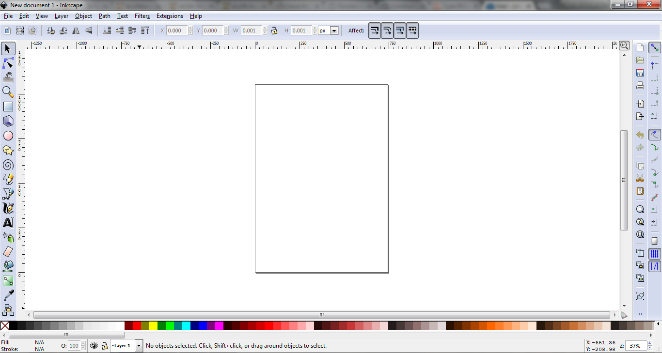
When we open Inkscape, it should look something like this:

You can use the + and – keys to zoom in and out to get a good view of your workspace. First of all, we need to set the flag’s proportions. The most common flag proportions in the world are 2:3, 1:2, and 3:5, so we’ll choose one of them for this project. You can really choose any proportions (for example, the real-life flag of Togo’s proportions are the golden ratio!), but let’s stick with one of the simple ones for this.

To change the aspect ratio, we go to File > Document Properties. It should open up a window like this:

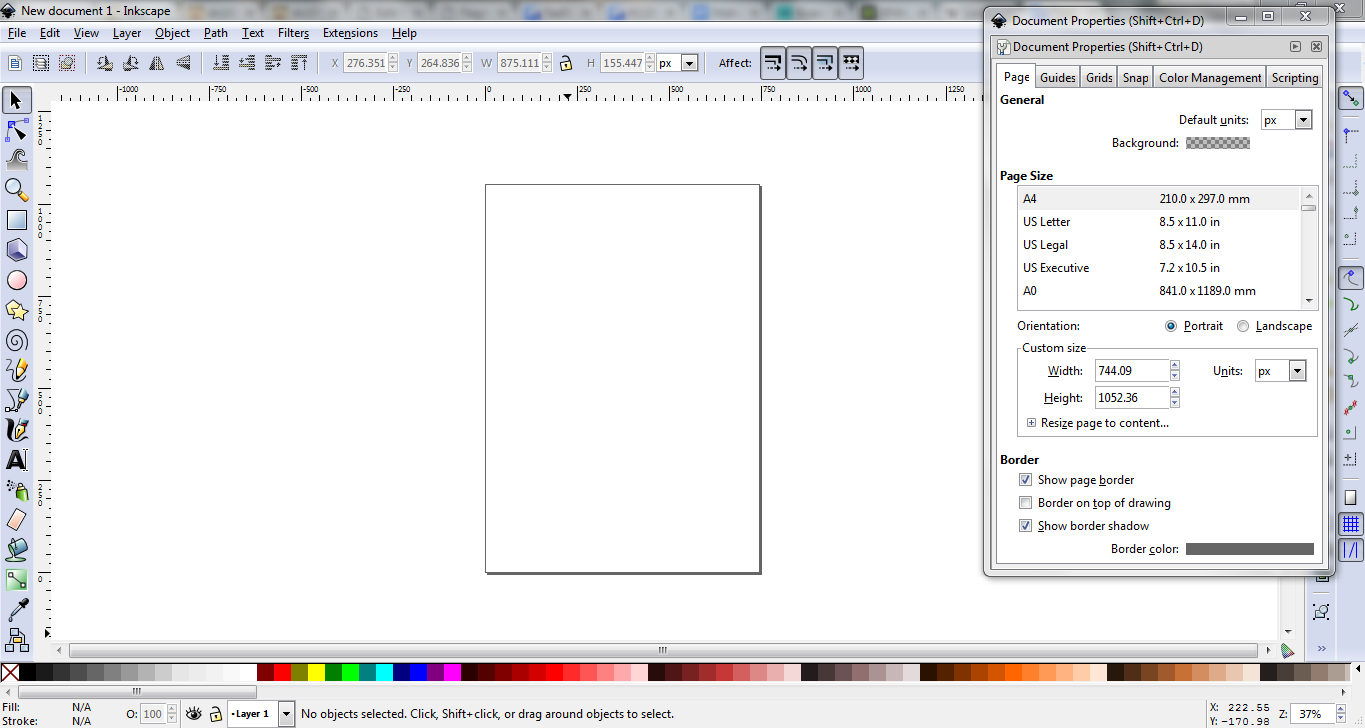
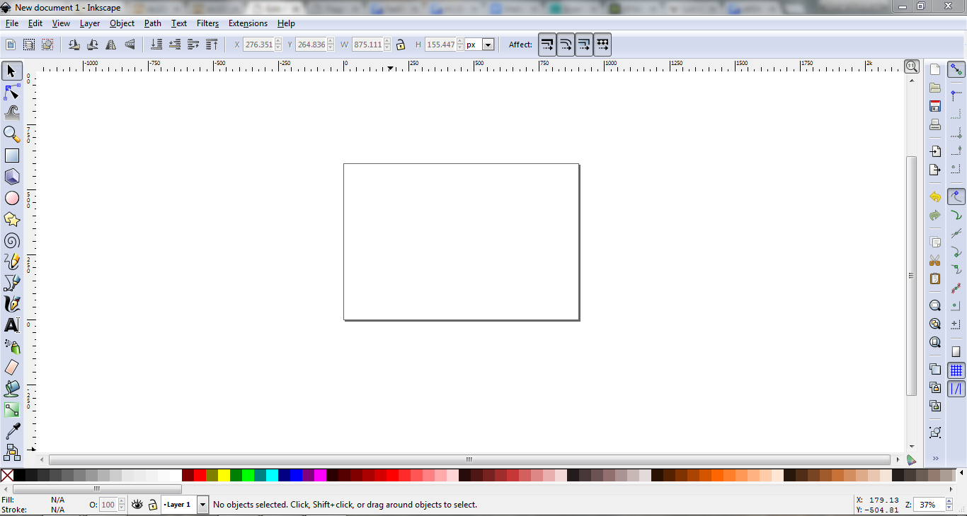
About halfway down the window, you can see a section called Custom Size. We’ll set the width to 900 and the height to 600, a 2:3 aspect ratio. Close out of the window and you’ll see that the working area is now in the correct proportions:

Now we need to add a “background” for our flag. This is just to make sure the flag isn’t transparent. On the sidebar on the left side of the screen, there’s this button used for adding rectangles:

Click it, then click and drag in the workspace to place a rectangle. SizeĀ and location don’t matter here. Up at the top, you should see W and H followed by numbers. Type 900 into the W box and 600 into the H box (the proportions we set earlier). To align this new rectangle correctly, click on it, then go to Object > Align and Distribute. Your screen should now look something like this:

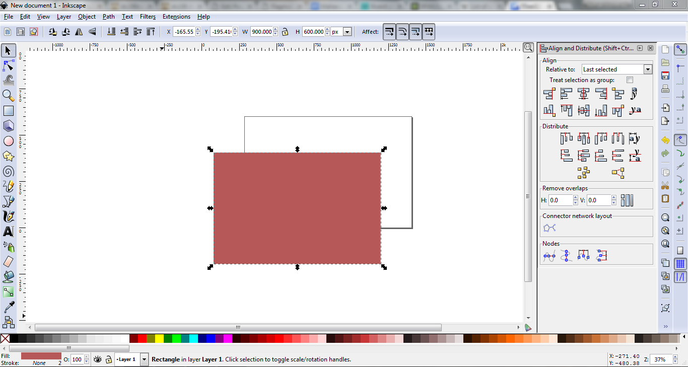
We’ll align it relative to Page. Click both of these buttons to center the rectangle on the workspace:

Then, in the spectrum of colours at the bottom of the screen, click the colour you want the background of your flag to be. For this example, I’m just going to choose white. With all this done, we’re ready to actually start designing our flag!

2) Design

Now that we’ve prepared everything, our workspace should look roughly like this:

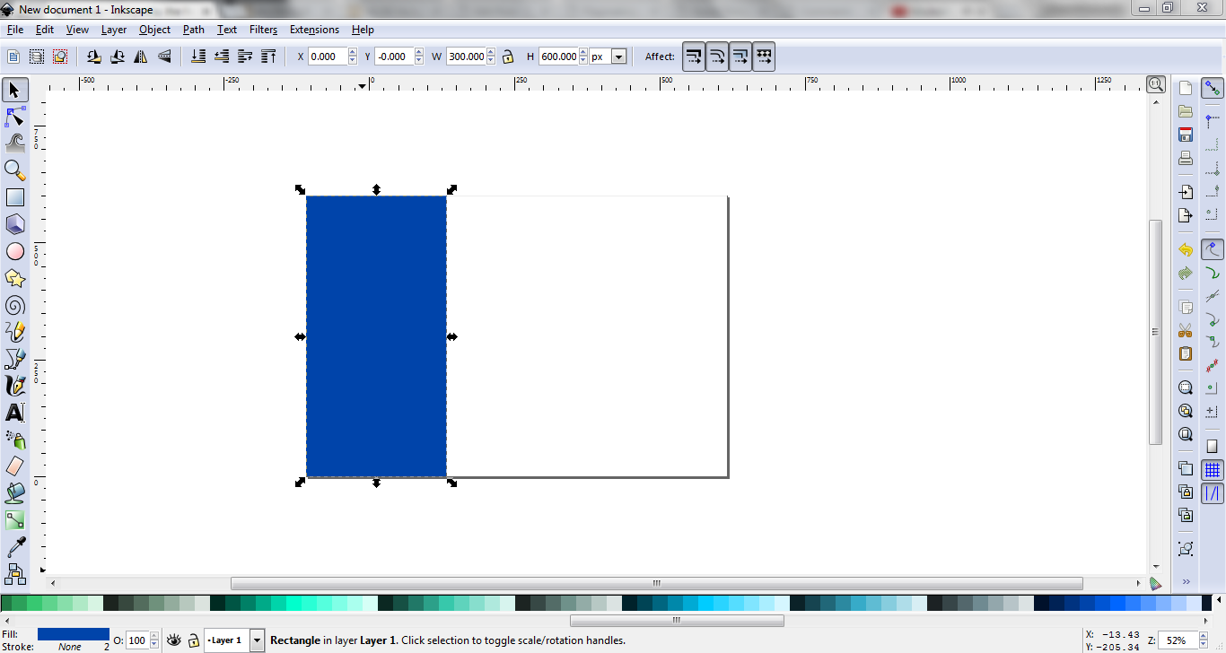
Now I’m going to add another rectangle. This one’s proportions will be W 300 (1/3 of the flag’s width) and H 600 (the whole height). In addition, I’m going to set both the X and Y values to 0, so the rectangle will be aligned correctly. I’m also making it a nice blue so we don’t lose it in all the white. The screen now looks like this:

Next, I’m going to add a circle. To do that, use the circle tool on the sidebar. That’s this one:

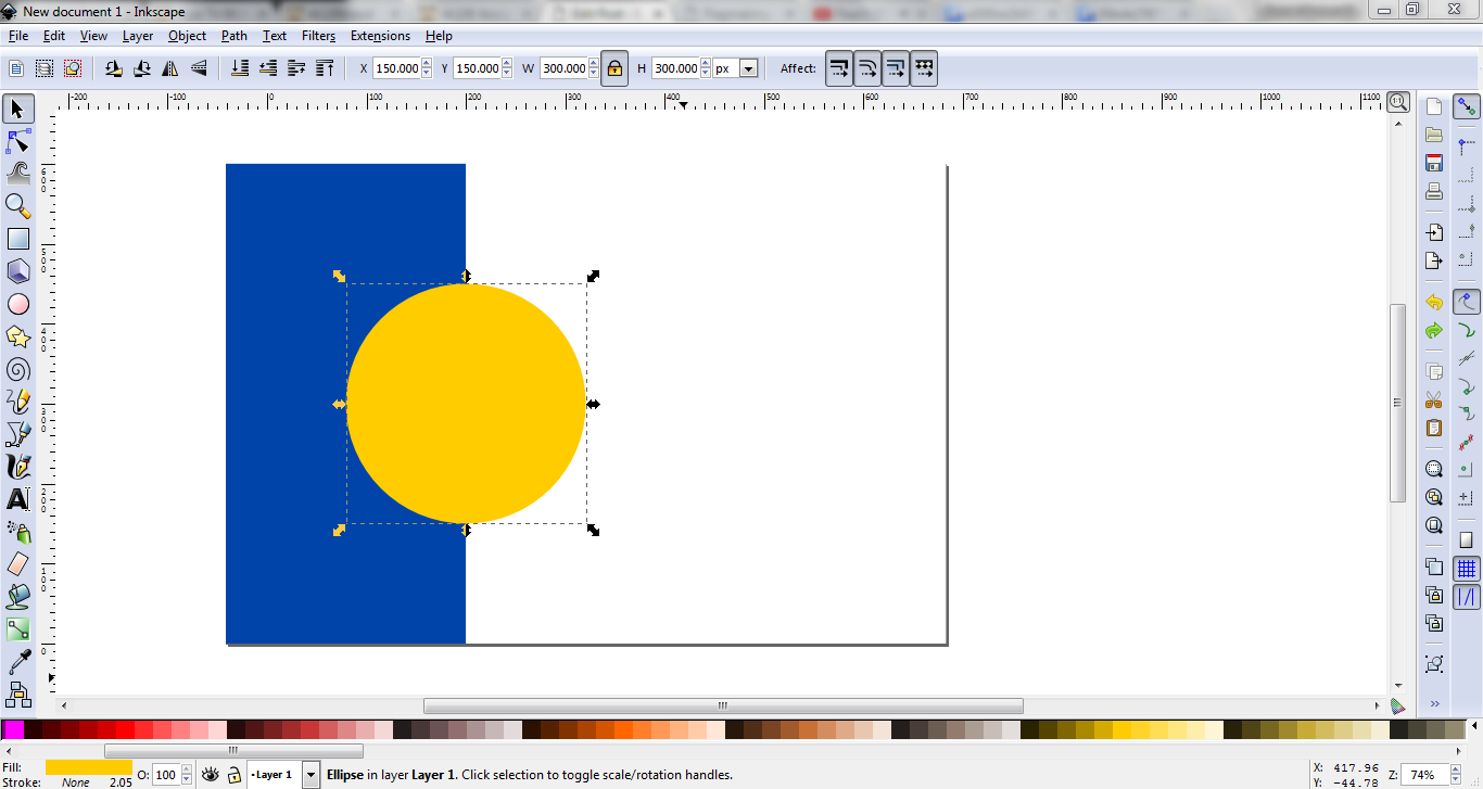
Once the circle’s added, let’s set its W and H to 300 each (we want a circle, not an oval), and its X and Y to 125. This should put the circle in the middle of the flag vertically, and centered on the border between the white and blue rectangles horizontally. Let’s make the circle a golden yellow, since sun imagery is really big in Sarkik:

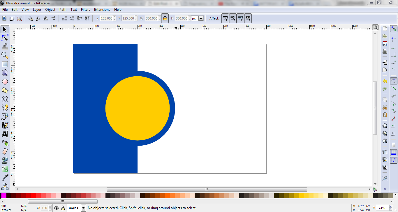
Now do the same thing over again, but set the values to W 350, H 350, X 125, Y 125. Then, using the colour picker tool on the sidebar, pick the colour of the blue rectangle. Lastly, click the “lower selection one step” button at the top to but this blue circle beneath the golden one. For reference, here are the two tools:

Our flag now looks like this:

This’d be a perfectly respectable flag, but I’m going to make it a little more Sarkik-y. Take this cropped map of Sarkik and copy and paste it into the Inkscape workspace:

Set this image’s W and H to 225 and 205, respectively. Now, using the star tool, put some five-pointed stars over the locations of the islands. For a better effect, make the size of the star relative to the size of the island. The star tool and the appropriate settings:

If you hold the Ctrl key while placing the stars, they’ll snap to some shaper angles, so you don’t end up with stars at 37.652°. Once you’ve placed the stars, feel free to delete the map. Now, click and drag over the stars (or Shift-Click each one). Then, go to Object > Group. The stars should now be grouped as a single object. Now we should have something like this:

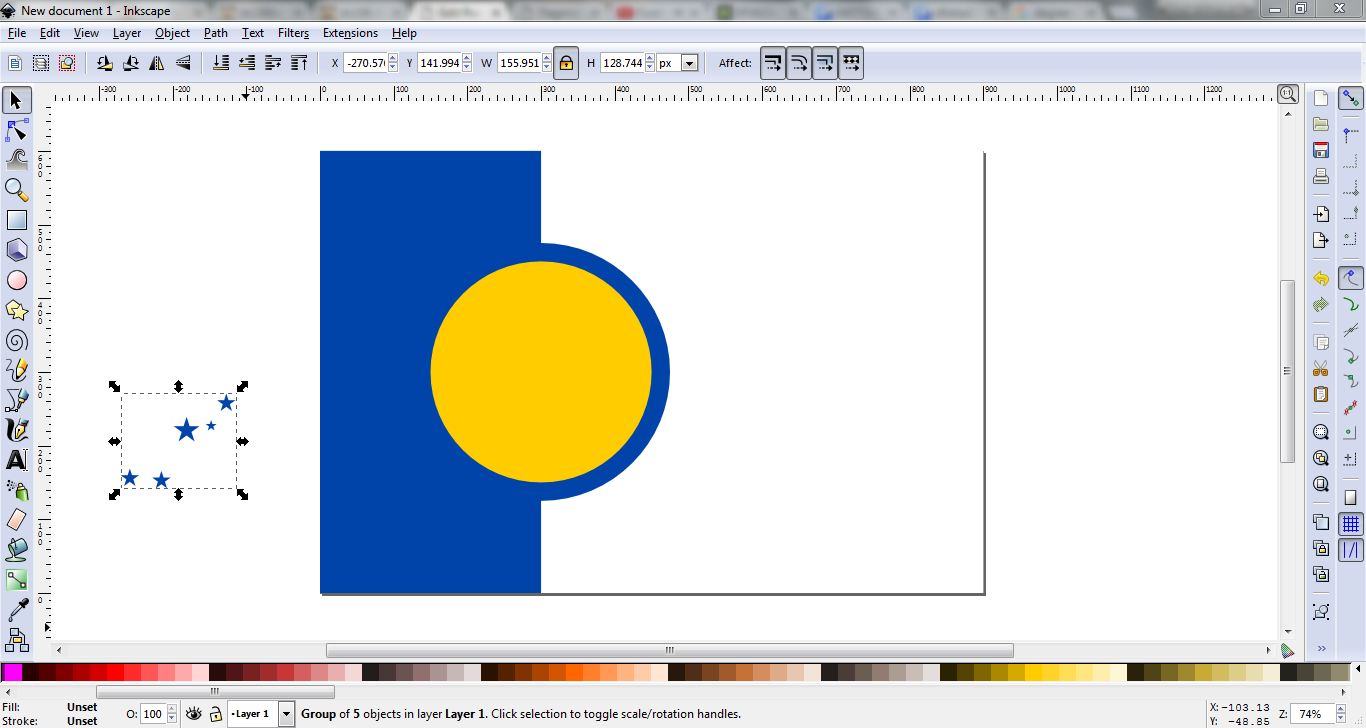
While you have the stars selected, Shift-Click on the yellow circle. Once you have both selected, go back to Object > Align and Distribute. This time, we’ll be aligning relative toĀ Last Selected. Click those same buttons as we did earlier to center the stars inside the circle. Once you’ve done that, the flag should look like this:

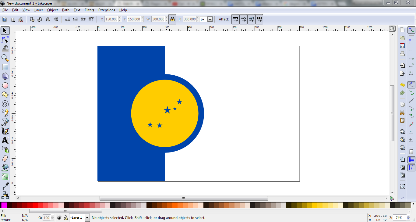
And that’ll be our flag! It’s not the most complicated thing in the world, but I don’t think it looks too shabby.

3) Saving/Exporting

Now just save it as a .svg file (that’s an acronym for “scalable vector graphics”. It’s a common vector file type). To export a raster image, go toĀ File >Ā Export as Bitmap. Make sure you have theĀ Page option selected, then just clickĀ Export and you should get a .png file of the flag!

Once all that’s done, we end up with this:

sarkik outline

(I’ve added a black outline so you can still see the flag correctly on this white webpage)

And that’s how you make a flag in Inkscape! There are some more complicated things you can do, but flags tend to be relatively minimalist (unless you’re a Liberian county) and simple, so you won’t need to do anything too complicated for most of them. Now you know how to make flags, and I have a flag for a country that I’ve been putting off making a flag for (honestly the reason I chose this assignment. Multitasking!). We both win!

Also, check out this cool animation of our flag waving:

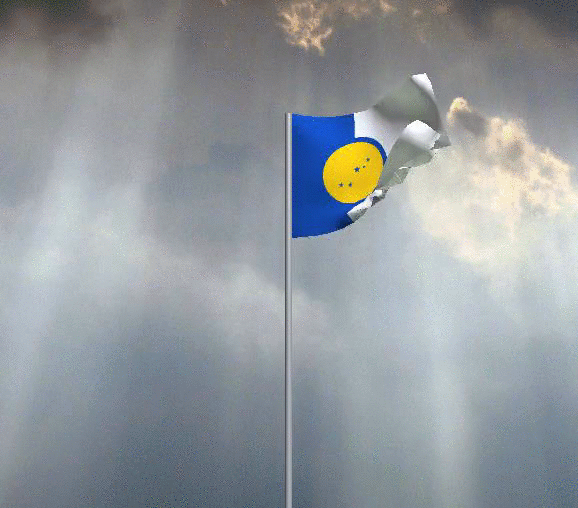
or the high-quality version on the waving flag generator.

The tools I used to make this post:

  • Inkscape (obviously)
  • Gyazo (for taking the screenshots and the gif)
  • Online Flag Waver (rad tool for generating a waving flag animation)

Some Things Never Change

?????

For my first assignment from the Assignment BankĀ for DS106, I’ve decided to do the Wayback Machine Assignment. I’m supposed to use the Wayback Machine to look at versions of a website in the past, and compare it with later versions. Instead, I’ll be looking at a website that doesn’tĀ have versions to compare.

Space Jam was released in November of 1996. Warner Bros. had a website created to promote the film,Ā a bold move at the time. In 1996, there were 36 million internet-users. In 2016, there are 3.6Ā billion (a 100-fold increase in 20 years). For this relatively small audience, the gloriousĀ Space Jam site was created.

January 24??, 1997 is the earliest date the Wayback Machine has an archived version of the main page of site for. There’s also an archive of the intro pageĀ from December 27??, 1996, but the main page is more important:

TheĀ Space JamĀ website has been moved to a different address on Warner Bros.’ main website, but it still exists:

20 years later, and the only differences are:

  1. The star that takes you to the site credits is gone.
  2. There’s a link to legal information.

That’s it. TheĀ Space Jam website is interesting not because it has changed so drastically over the years, but because it hasn’t really changed at all. It’s become something of a digital museum, a relic of an internet that no longer exists. Exploring around the site can show you just how much digital media has changed over the years.

It has it all: horrendously 90s choice of red Times New Roman on a starry background, an unusual and brokenĀ navigation bar at the top, and super fun orange letters on a purple background. Every page of the site looks similar to this. All except the page that links to the Warner Bros. Studio Store:

This page is interesting because it still has theĀ Space Jam navigation bar on the left, while the remainder of the screen is filled by the WB Shop site. The stark contrast between the 1996 and 2016 web design makes this page especially interesting. While theĀ Space Jam site as a whole serves as a preserved relic of the internet’s ancient past, this particular page gives a side-by-side comparison, showing how different things have become in the 20 years since the site went up.

Space Jam‘s website is interesting not because of how much it has changed in the past two decades, but in how little it has changed. The internet has increased in size a hundredfold, and websites have gotten exponentially smoother, cleaner, and larger, but theĀ Space JamĀ site has stayed the same. It hasn’t been taken down, found only in some third-party’s archive; it isn’t lost forever; it hasn’t been updated. It’s one of the internet’s few constant values.

Web Assignment: Catching the Buzz

Quizz banner.jpg

For my last DS106 assignment bank creation, I wanted to do something I had not done before from a “new to me” category. I had also determined in last week’s course reflection that I wanted to involve my family in this week’s project. So, I worked with my husband to choose the “Buzzfeed Personality Quiz” assignment.

The assignment itself is pretty straightforward: create a personality quiz using the Buzzfeed site. There are some additional parameters for minimum number of outcomes and questions, as well as a requirement that photos be included.

My husband helped me choose a quiz storyline that fit into my course theme of “the future.” After bouncing a few ideas around, I landed on “What’s Your Post-Apocalyptic Community?” I wanted to bring my theme back to current trends in popular culture wherein people discuss possible disaster scenarios in semi-serious, semi-joking ways. I worked with my husband to create four future communities and six questions to help determine community membership.

Now would be the perfect time to try it out and see where you land.

quiz snip.JPG

I spent way more time on this quiz than I would have imagined. It was also the assignment which developed the most as a story behind the scenes – lots of thought and discussion went into exploring potential storylines. I worked with my husband on the initial bits, ran several ideas by co-workers and friends, and found myself contemplating my various future communities at random times of the day. It was a lot of fun feeling that invested!

In addition to writing up the quiz sections as outlined by the Buzzfeed layout, I created a number of pictures and tracked down different images through the Flickr search for images licensed for reuse. I made sure to give each image proper credit (I appreciate that Buzzfeed includes a spot to do this), as well as the url for each photo.

I feel accomplished having created this quiz and trying something completely new-to-me. I also have some ideas for Buzzfeed’s community suggestion box based on features that I would have liked to include in my quiz, like tie-breaker questions, multi-path options and secondary responses.


Run ROB!

The Story

Running can sometimes be very boring to me if I don’t have something to keep my entertained or new ways of switching up. This is the first week I got to choose my own assignment from the ds106 Read more…

The post Run ROB! appeared first on Robert Grotans – Professional Website.